Built as part of the Carrd Course - Check it out
Since 2006, we’ve helped some of the world’s top companies design, build, and ship amazing products and services.
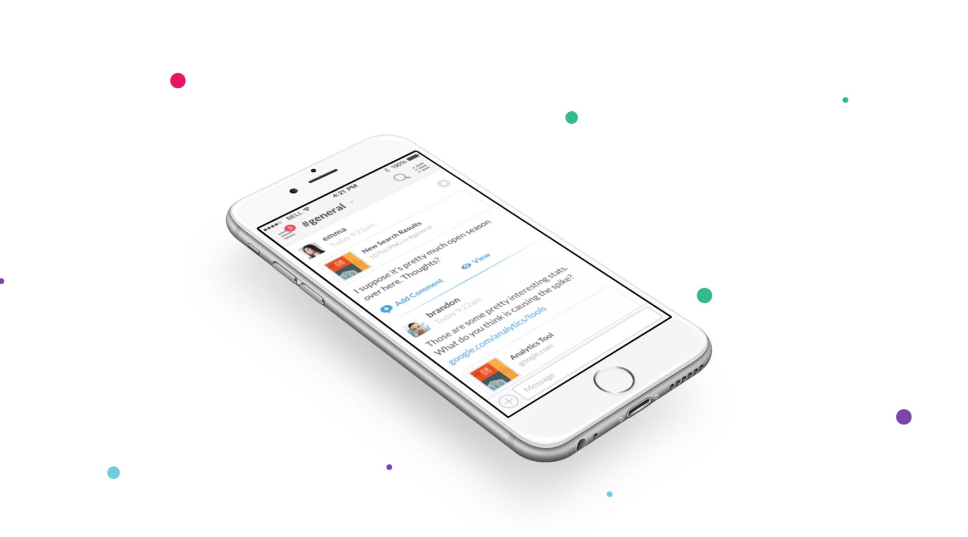
How we got
people talking
Team communication for 21st
Century
Expertise
Design and Interaction
Expertise
Design and Interaction
Expertise
Design and Interaction
Expertise
Design and Interaction
The Spark
The brainchild of Flickr co-founder Stewart Butterfield, Slack has risen to become the web's most popular corporate chat client.
In a crowded space and seemingly saturated market, Slack has become a cult hit. It's beloved for its gorgeous, bubbly interface and tons of delightful little interactions throughout the app.

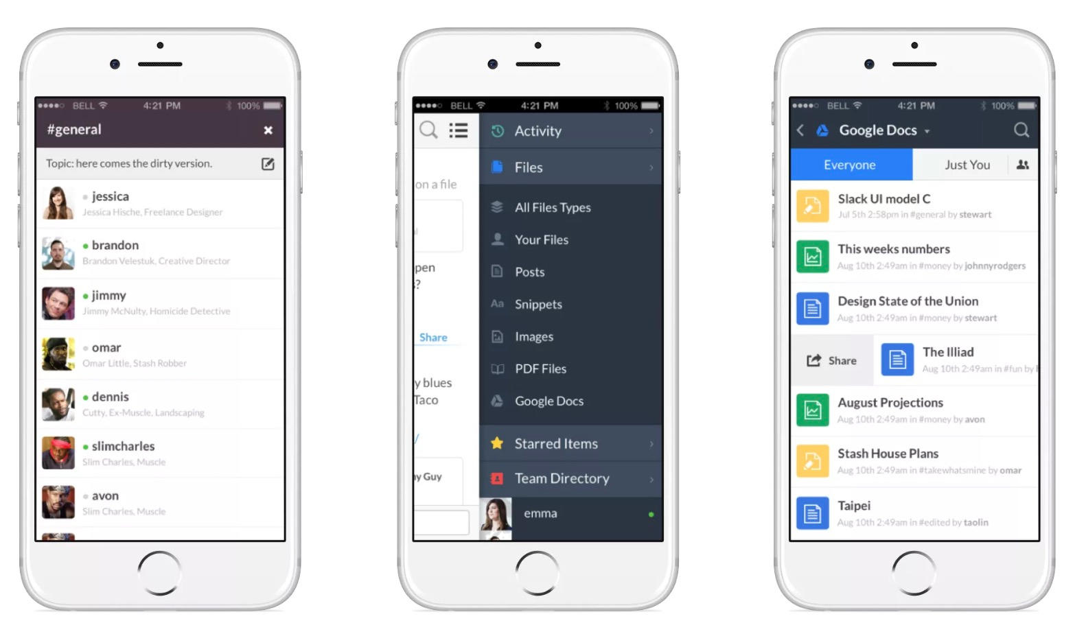
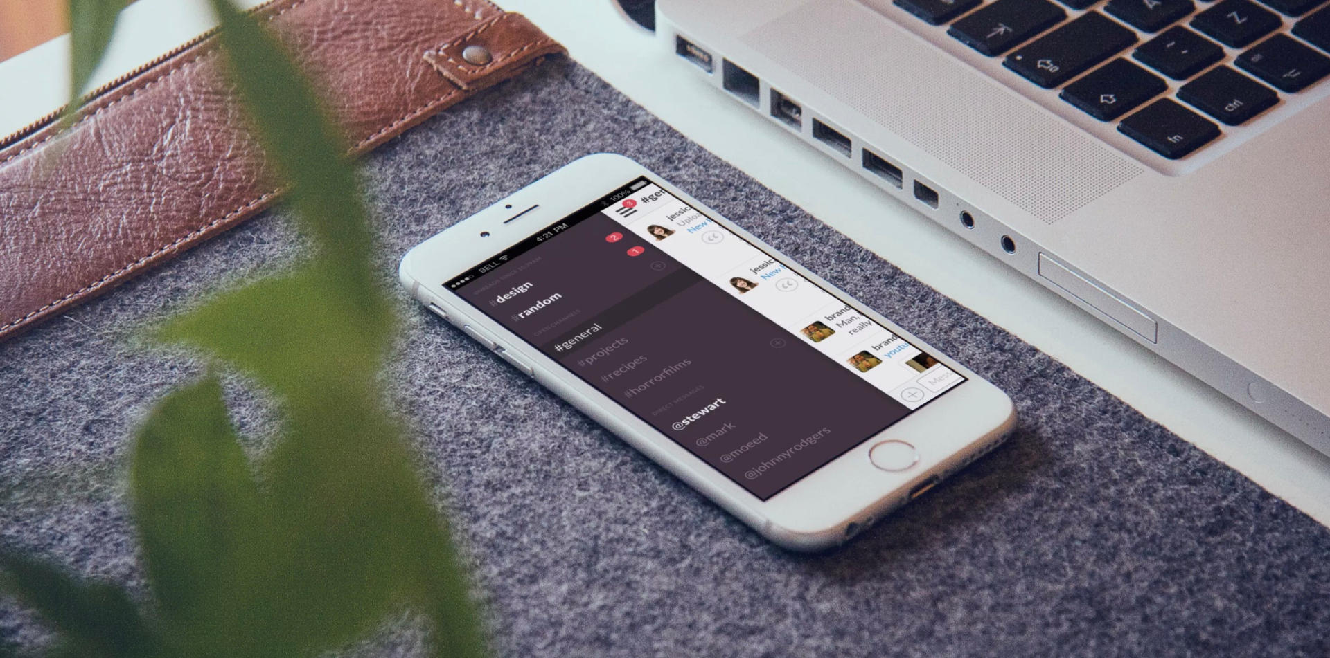

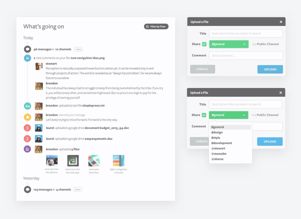
We were there from the start. Stewart and his team came to us when Slack was a rough, unstyled prototype, and we worked with them to design the app from the ground up. The brand, the web app, the mobile app, and even the marketing site—the works.

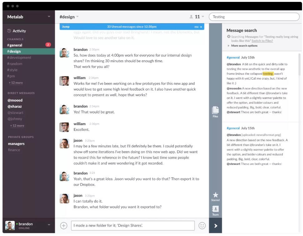

How we stood out from
the crowd
It feels different
We strived to add chock full of fun little interactions to the product. The logo animates in a burst of colors as it loads; modals slide down from the top of the screen; changing teams flips the screen around like a deck of cards.
Throughout the entire product, everything seems to playfully jump around and pop off the screen. Each of these interactions is designed not only to help the user understand what’s going on, but put a little smile on their face.
We gave it the color scheme of a video game, not an enterprise collaboration product.
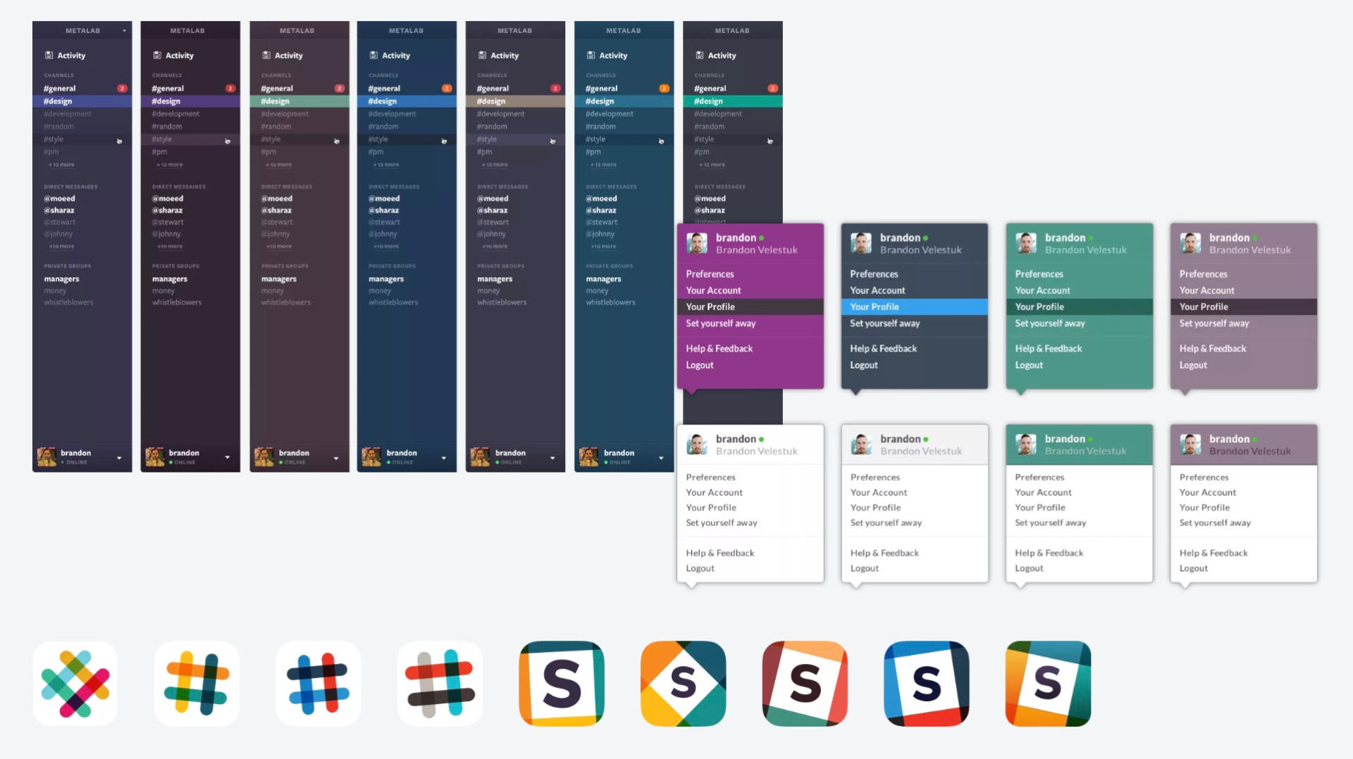

We were there from the start. Stewart and his team came to us when Slack was a rough, unstyled prototype, and we worked with them to design the app from the ground up. The brand, the web app, the mobile app, and even the marketing site—the works.
